Thursday, September 30, 2010

Quotes/Lyrics

It's really hard for me to choose ten quotes/lyrics.
There are way too many that i like, so since we were
told about this the other day, I've just been writing
lyrics that I like as I hear them. There are tons more,
and probably others that would make a much better
top ten.
It's gonna be really hard to just choose one now.

  • Son, I loved you at your darkest.
  • God save this gunslinging generation.
  • Hearts aren't beating, they're counting down.
  • This pistol is my ministry.
  • Love, jealous one, love.
  • Swallow your pride, because silence is golden.
  • Come now, sleep.
  • Tonight the south is on fire.
  • Judge says I am fit to swing.
  • Love is easier made then kept.

Tuesday, September 28, 2010

Texture Wall Piece

The entire piece is made by cardboard,  cereal box, foam board (base), magazine text, black masking tape, and hot glue. I used the black masking tape instead of black spray paint because I liked the texture it gave it.
This is the way my final piece looks. I went back and made some changes before we received our final grade and crit on them. First, I made it "pop" further off the wall than it was originally. At first, it was just mounted on a single piece of board, and now it stand around two inches away from the wall. I also raised my center square slightly instead of leaving it flat. I went back and made the negative space as well so you could see the text inside the biggest square through the cutout of a smaller square. During group crit, someone mentioned it had a "magnifying glass" effect to it, which I had never thought of.

Tuesday, September 21, 2010

BrainStorming!

These are just a few ideas that our group discussed when talking about the next part of the project.

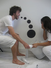
  1. skydiving! w/black parachutes
  2. censorship (dots as censors)
  3. play fight? (dots for fists etc)
  4. distance from camera
  5. dot hands (only arms and "hands" in frame)
  6. dot fingers (really small frame, shot inside freezer or ice-chest or something)
  7. dots and robbers
  8. dot heads (balcony)
  9. zombie dots (TP)
  10. Target dots 
  11. drunken dots 
  12. zits on Sam Houston statue

Sunday, September 19, 2010

Texture Studies - Process and Final

When I was making my textures, I didn't %100 put the
thought into them that they were going to be used as
backgrounds for a design I had already created.
I made a few of my texture pieces simply because I thought
they looked cool on their own...

On a few of them, I decided to alter them and incorporate the original design on top of the texture piece. On a few of these I did this by using different pieces of texture, that way it could contrast and unify at the same time.


The Exquisite Corpse pt. 2

The gargantuous swordfish running and sweaty rocks.
------------------------------------------------------------------------------------------------------------------------------------
I got really frustrated with the second part to this. It seemed like the more I wandered around looking for something to take a picture of, the more frustrated I got. I couldn't find an answer anywhere. I think maybe I was looking for a image that could translate my sentence very literally, and with the sentence I have, who knows how long I would have to continue looking. There were a few things I saw that made me think of my sentence, people jogging, a blue boat, and this really cool sign at a sea food restaurant, but none of them seemed satisfying enough. Each was just a small piece of my sentence. 
The picture that is posted above happens to be just a random picture I snapped over the weekend with my iphone (which I enjoy doing). When I looked at this after taking it, it reminded me of my sentence... No matter how its presented, the sky always reminds me of the ocean, and vise-versa. The sky reminding me of the ocean made me think of my swordfish. The small rebar pieces sticking out of the top of the "rocks/bricks" makes me think of the running, the way that they slope down, all the way down each one the same distance below or above as the one before it. Kind of like a pace when your running.

9/10/10 - Creativity

Creativity: without craft, it will escape.

Some attributes of creativity we discussed were:  
playful, sensitivity, productivity, originality, flexibility, organization, fluency, being adaptable, being observant, emotion, use of senses, perception, imagination, action, willingness to try, and curiosity.

All of these are not needed to be considered creative, but rather a combination of them. Some people possess more of the attributes than others, and some are non-existent altogether for some people. For example, I have a vivid, always roaming imagination, but I am not always willing to try the ideas I come up with. Me not willing to try something could be described as a block for me as an artist. A block is anything that distracts us or blocks us from our creativity. 

Some blocks that we discussed were: 
environmental/your surroundings, expressive, cultural (such as rules about what art should be), emotional (a fear of failure), intellectual, and physical.


 ----------------------------------------------------------------------------------------------------------------------------


In class we were also asked to quickly make a list of 100 loves and 100 things that bug us as fast as we could, without stopping to think about it.
Here is my list... 


Wednesday, September 15, 2010

Cardboard Acorn - Final

Today was the final crit on our cardboard objects. We had a classroom crit as well as a discussion/crit within our table groups.
My table group had a few pointers, suggestions and some basic advice on how I could "better" my object if I were to make modifications, or do it all over again.
First, it was pointed out that my scale was slightly off... The piece that sticks out of the bottom looks much longer than it should, and the slope from top to bottom of te acorn did not have enough of a "curve" to it. When I started out with the basic frame, the overall scale was fine, but after adding a full body to my object, there were some parts that stuck out to far, or were too long.
It was also suggested that I could somewhat easily add the curve that my acorn needs to show the body accurately without completely starting over. If I were to do this successfuly, this would also eliminate the lenght issue of the bottom.


You can see in this picture, that the body does not have the slope that the real acorn has. You can also see how the length is an issue.


The top piece is probably the beat part and what looks most like the real acorn.


- Posted using BlogPress from my iPhone

Tuesday, September 14, 2010

Finishing the Cardboard Acorn


I decided to stuff the inside with paper to give it a little more structure that way I would be able to wrap it with the paper easier.


It didn't turn out looking as good as I would have liked, but it does resemble my object. If I were to do this again, I think there are a number of things I would do differently. I would construct the main body a bit differently. The way I built it was strong enough on it's own, but once it came to being wrapped in paper and holding everything else up, it was difficult to do. It made it very hard to finish.


- Posted using BlogPress from my iPhone

Monday, September 13, 2010

The Exquisite Corpse

"The gargantuous swordfish running and sweaty rocks."


Playful/Periodic and Cardboard Progress

These are my final two compositions. Playful is on the left and periodic is on the right.
My group pointed out a few things during the critique this morning. There are a few small flaws, like a bump in one of my lines, and one is posted square in the center of the black board.
They voted that the periodic one is the piece I use for the final part of the project. They felt it was my strongest and showed some improvement over the first part, with the dots.


Cardboard

I decided to cover the top and try to add a bit of "texture" to it.
The top of it, finished for the most part.
Now all I need to do is figure out a way to finish the body of it.

Friday, September 10, 2010

Living With Art - 9/3/10

Artists work to do a lot more than just create something thats interesting to look at, artists perform at least four other important functions outlined in this reading.
First, artists record. Secondly, artists give "tangible form to the unknown." Third, artists "give tangible form to feelings" as well. Fourth, artists offer "an innovative way of seeing."

During lecture, we discussed as a class several things that could classify something as art. Some of these were:
  •  there was effort put into it
  •  it inspires thought and/or emotion
  •  the usefulness of the piece 
  •  instinctual/not instinctual characteristics 
  •  the artist simply thought of it
  •  there was effort
  •  people like the way it looks
There were many more than this, and some weren't really agreed upon as a whole. For example, using the reasoning that "something looks good" as a characteristic to classify something as art may not be agreed upon by everyone who views it.
What is considered art, varies because peoples points of views vary.


Representation - where one thing stands in for another. 
Styles of representation discussed:
  1. Naturalistic - as in nature.
  2. Realistic - true to life.
  3. Stylized- simplified to emphasize important details.
  4. Abstract - highly stylized (may not be recognizable).
We also created a "Scale of Representation" which has the realistic to the furthest left, and the stylized and abstract to the furthest right, everything else falls into place between.


While you can't specifically determine what makes a person 'creative', nearly all creative people tend to possess certain traits. Some of these mentioned are:
  1. Sensitivity - gives a person a heightened awareness of the senses.
  2. Flexibility - easily adapts to new situations to see the possibilities.
  3. Originality - giving uncommon responses to situations and in problem solving situations.
  4. Playfulness - sense of humor, experimentation with work.
  5. Productivity - the ability to create ideas and (most of all) follow through with them.
  6. Organization - ability to have things in  an effective order.

Even when being many of the other things mentioned in class and in the reading, art is always an expression of the artist. The art shows the artists expression to the viewer.


Friday, September 3, 2010

cardboard project progress

Sketches of my object.
This is the main piece that will be supporting the rest of the body. It is two semi-circles that I made "slits" into so they could interlock and hold together easily. I then folded four rectangle pieces that are a little over a foot long to create the base of the "stem."
This is after I covered the "stem" piece so the project could stand as a whole without falling over.


This is actually a picture of two circles that I cut to be the same size. This will serve as the top.
I decided to use this section of cardboard for the circle top because it had two slits in it, and I could use the opening of the slits to help create the openings I needed.
This is the main body together as a whole for the most part. Since this picture,  I've started working on adding the texture and bumps to the top of it to give it more of a 3D feel instead of just that flat top.

So far I think it's turning out really well. I didn't really start out with a set plan, I just had one idea on how to lock the main body together, and ran with it from there.

Wednesday, September 1, 2010

From Forty to Final Four

My strongest sixteen. There are four from each category.

After selecting my strongest sixteen pieces from the forty(+) that I created, the group gathered together to critique each others work and choose (collectively) which we felt were the strongest, per each category.
The group also pointed out a few things that may have never been noticed by myself, seeing as I'm the one who designed each piece, and therefore see it the way I want to and not necessarily the way it really is.
One of the biggest pieces of information I received was to possibly vary the size of my dots a bit more. Most of the dots seemed to be a "medium" size, and the small dots seemed to be just a little too small. It was also recommended that I could have a more exaggerated scale shift which would be more prone to show the various sizes of dots that way the similar sized dots wouldn't make the layout look so "plain." There were a few that also had too much negative space. This could also be resolved by modifying the size of the dots, or simply changing the spacing between the dots.


These are the final four, chosen by the group, but I chose to switch the top one out with another that I felt was stronger.
These are my final four. I believe this will be my final layout as well.
The piece on the bottom right is the one I chose to add after the group selected the previous four. It shows continuism quite a bit better than the piece directly to the left of it (which is actually being used to portray closure, but the group had previously chose it for continuism).


When we did our group critique, the main suggestion I received from everyone was that maybe I should vary my size of dots across all of my pieces. Overall, out of all of them, they seemed to have similar sized dots.