Paul Klees' 'Ancient Sounds' - 1925
 |
| In this painting, he is repetitive with the use of squares of various colors but similar in the shades of colors. The different colors he chose create harmony and an overall theme color wise... they look like they belong together. He also uses roughly the same size of square throughout which contributes to the repetition. I'd say this sits more towards the 'harmony' side of the scale... it has repetition and rhythm and virtually no chaos to it. |
Paul Klees' "Eros" - 1923
 |
| This painting, much like the first from this artist, uses mostly a basic shape and then repeats it throughout. He once again uses similar colors that just go very well together. This painting shows some continuance to me while the other one did not. Adding the arrows pointing upward along with the design funneling up works very well. This painting would sit near the very end at harmony on the scale in my opinion. It is a design that uses repetition with shapes, but is very complete and 'put together' as far as the movement of it... this leaves no room for chaos. |
Jackson Pollock's "No. 5" - 1948
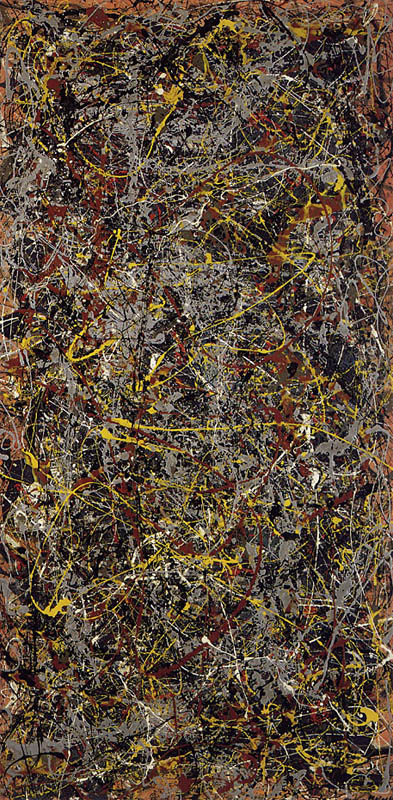 |
| In this painting, he essentially uses line for repetition even though its a very sloppy "line"/splatter. The repetition could also be some certain colors, like the yellow for example, it seems to be repeated in various ares throughout and it really stands out. This sits pretty far towards the chaotic side. You can tell he splattered/dripped paint across the canvas, but like i mentioned with the yellow, some colors seemed to be somewhat placed in certain areas, so that shows some control. |
Jackson Pollocks "Untitled (Green Silver)" - 1949
 |
| This one, once again uses the sloppiness look of splattering/slinging paint all over. Colors seem to be a little more all over the place on this one, but the movement and technique is repeated throughout regardless. This one, in my opinion sits all the way at the contrast/chaos end of the scale. |
Minimalism:
Dan Flavins "Untitled" Installation at the Menil Collection - 1996
 |
| After seeing this in person, its hard to find a picture that does it justice. Regardless, you can still see he he repeats the simple "line" of light along the wall... along the other side of the room as well. There is also a repeated pattern of colors that continues throughout. This installation piece shows a lot of harmony with repetition and rhythm being shown with the consistent amount of space taken into consideration between each light. |
Dan Flavins "Untitled" Installation (to Don Judd) - 1987
 |
| Repetition is shown here with the five separate "towers" that are each made up with the same amount of lights. Each one is the same size and topped the exact same way. He also shows a somewhat progression of color from left to right. This, like many of his installations, shows nothing but harmony and rhythm. The spacing between the lights and the area taken up within the room is very consistent and has been taken into consideration. |
Frank Stellas "Sunset Beach" - 1967
 |
| Obviously, this piece shows repetition by simply repeating the same shape over and over progressively getting smaller and smaller towards the middle. There is a nice progression of color as well which really adds to how the squares get smaller and smaller. This piece shows a lot of harmony mostly because of the organized progression of color as the size gets smaller. I'm sure the direction of color was thought out as he could have done it the reverse of the way he chose. |
Frank Stellas "Tuxedo Junction" - 1960
 |
| Tuxedo Junction shows repetition with the white lines on a black background. The shape the lines make is also repeated until it gets so big, it disappears out of the picture. This shows mostly harmony because all of the lines are spaced perfectly, and run parallel to another, but the fading/splotchiness of the white lines makes it contrast a little and look just slightly sloppy. |
Post Minimalism:
Rachel Whitereads "Embankment" - 2006
 |
| The repetition here is shown by repeating the same basic shape and stacking them on top of one another, over and over. The fact that all of them are also white, adds to this effect. To me, this would sit somewhere in the middle of our scale because it has that look like a bunch of stuff is just stacked up on top of each other, but there of course was some sort of strategy and placement involved which makes it look very organized as well. Its kind of split to me... |
Rachel Whitereads "Untitled Library" - 1999
 |
| Repetition is show here by creating the "book" effect. The artist repeated the shapes over and over which made this look somewhat like a bookshelf. You can also see the layers of it where it looks like each shelf is sitting on top of the other one. This also, in my opinion, sits somewhere near the middle of the scale, because it has the feeling of a real library book shelf where there are an overwhelmingly lot of books on the shelf. |
Tom Friedman "Untitled (Pencils)" - 1995
 |
| This is very similar to what we are currently doing with our Modular Madness project. He shows repetition by simply using the same object over and over to create one big object. In this case, its pencils stuck together over and over. This looks pretty chaotic to me because it has the appearance like a bunch of pencils were just heaped together. |
Tom Friedman "Untitled" - 1997
 |
| This is once again, similar to our current 3D project in the sense that he uses the same similar object to show repetition. The artist used pills of various shapes, sizes and colors, but the fact that they are the same object creates the repetition here. This is somewhat chaotic and somewhat controlled and organized. You can see the pills were strategically arranged on the floor seeing as they are more bunched together in the center, and spread out a little bit farther on the outside. The artist took the spacing of each pill into consideration. This is also slightly chaotic because at a quick first glance, it looks as if a bunch of pills were dropped/thrown all over the floor. |
Modern/Contemporary:
Cy Twomblys "Untitled VII" - 2005
 |
| This is a lot like our mark making project. Repetition is shown by how he made marks using the same movement over and over, or at least it appears that way. Along with using the same gesture over and over with red, the drips are also consistent throughout. This looks very chaotic because everything overlaps and its hard to distinctly make shapes out of it. |
Cy Twomblys "The Rose Exhibit" - 2009
 |
| This piece is very repetitive across the whole room really. It consists of three similar large scale paintings on three separate walls with the same objects and background colors on all three. All three have roses, but different colors of roses on each one. Each painting consist of three roses, all of basically the same size, on the same side of the painting, and spaced the same distance apart. All of this shows repetition and organization. |
No comments:
Post a Comment